Your ticket would just be an empty
piece of paper
with the correct data.
Your ticket is nothing without
the correct data. Use these elements and
placeholders.
After reading this article, you know all about
the different placeholders you can use. You
also know which element type you should use
for which goal.
Let's get you started
Element types
In the ticket layout designer,
you have the following elements to style
and populate your ticket layout.
 | This placeholder to add a barcode
to your layout. By default this
uses the standard iXpole
barcode. |
 | This placeholder will add a QR
code to your layout. By default
this uses the standard iXpole
barcode |
 | This element can be used to add an
image to your layout. When
selecting the image on the canvas,
you will have several options in
the styling page to modify your
image. |
 | This element can be used to
add a color area. A color area can
be a solid color but also a
gradient. These settings are to be
adjusted in the styling
pane. |
 | Use this element to add any
free text to the layout. When
dragging this element to the
layout, you will get a popup
window, where you can specify the
text you can to
display. |
Which placeholders you
can use
| Name | Placeholder | Type | Description |
|---|---|---|---|
| Account Type | {{Customer.AccountType}} | Text | Account type
description |
| Account Type Color | {{Customer.AccountTypeColor}} | Color | Account type color hex
code |
| Address | {{Customer.Address}} | Text | The address linked to the
sales |
| Event Date | {{Event.Date}} | Date | The date of the event |
| Buyer Type | {{Ticket.BuyerType}} | Text | Buyer type description |
| Buyer Type Color | {{Ticket.BuyerTypeColor}} | Color | Buyer type colr hex
code |
| Catering | {{Ticket.Catering}} | Text | The selected catering menu for
this ticket |
| Catering Color | {{Ticket.CateringColor}} | Color | Formula color hex code |
| Catering Description | {{Ticket.CateringDescription}} | Text | the selected catering
formula |
| Catering ShortDescription | {{Ticket.CateringShortDescription}} | Text | The title from the catering
menu |
| Catering Menu | {{Ticket.CateringMenu}} | Text | The menu description from the
catering menu |
| Catering Image | {{Ticket.CateringImage}} | URL | The link to the catering
menu image |
| Catering Location | {{Ticket.CateringLocation}} | Text | The catering menu location
description |
| Catering Type | {{Ticket.CateringType}} | Text | Catering type description |
| Catering Type Color | {{Ticket.CateringTypeColor}} | Color | Catering type colr hex
code |
| Contact Name | {{Customer.ContactName}} | Text | Contact person linked to the
sales |
| Customer Code | {{Customer.Code}} | Text | Code of the account |
| Customer Name | {{Customer.Name}} | Text | Name of the account |
| Entrance | {{Ticket.Entrance}} | Text | Entrance description |
| Entrance Color | {{Ticket.EntranceColor}} | Color | Entrance color hex code |
| Event Date | {{Event.Date}} | Date | The date of the event |
| Event End Date | {{Event.EndDate}} | Date | The end date of the event |
| Event End Time | {{Event.EndTime}} | Text | The end time of the event |
| Event Time | {{Event.Time}} | Time | The staring time of the
event |
| Event Subscription/Serie | {{Event.Subscription}} | Text | The subscription (or series)
of your event |
| Event Thumbnail | {{Event.Thumbnail}} | Image | Image url of the thumbnail of the
event |
| Event Description | {{Event.Description}} | Text | The name of the event |
| Event ExtraInfo | {{Event.ExtraInfo}} | Text | The extra info field on event
level |
| Season | {{Event.Season}} | Text | The description of the
season in which the event
occurs |
| Opponent | {{Event.Opponent}} | Text | The name of the opponent |
| Opponent Logo | {{Ticket.LogoAway}} | Image | The link to the logo of the
opponent. Can be used in an image
element |
| Guest Name | {{Ticket.GuestName}} | Text | The name of the invited
guest |
| Guest Email | {{Ticket.GuestEmail}} | Text | The email address of the invited
guest |
| Guest Company | {{Ticket.GuestCompany}} | Text | The company name of the invited
guest |
| Guest FirstName | {{Ticket.GuestFirstName}} | Text | The firstname of the invited
guest |
| Guest LastName | {{Ticket.GuestLastName}} | Text | The last name of the invited
guest |
| Stage | {{Ticket.Stage}} | Text | Stage level of the seat or
parking |
| Section | {{Ticket.Section}} | Text | Section level of the seat or
parking |
| Row | {{Ticket.Row}} | Text | Row level of the seat or
parking |
| Number | {{Ticket.Number}} | Text | Seat or parking number |
| Planinginfo | {{Ticket.PlanningInfo}} | HTML | The configured planning info based
on the selected catering, formula
of section |
| Ticket External Id | {{Ticket.TicketExternalId}} | Text | Ticket External id. |
| Ticket External Barcode | {{Ticket.TicketExternalBarcode}} | Text | Ticket external barcode. Can
also be used in the barcode
fields |
| Ticket External Contact | {{Ticket.TicketExternalContact}} | Text | External contact for the external
ticket |
| Ticket External Description | {{Ticket.TicketExternalDescription}} | Text | External ticket description (eg
seat or parking
string) |
| Ticket External Id | {{Ticket.TicketExternalId}} | Text | External ticket id |
| Ticket Internal Id | {{Ticket.Id}} | Text | Internal ticket id |
| Ticket Internal Uuid | {{Ticket.Uuid}} | Text | Internal ticket uuid |
| Ticket Price Excl. | {{Ticket.PriceExclTax}} | Decimal | Ticket price excl tax |
| Ticket Price Incl. | {{Ticket.PriceInclTax}} | Decimal | Ticket price incl. tax |
| Ticket Sequence | {{Ticket.TicketSequence}} | Text | The seuqence of the ticket in the
order |
| Preemption Type | {{Ticket.PreemptionType}} | Text | Preemption type description |
| Preemption Type Color | {{Ticket.PreemptionTypeColor}} | Color | Preemption type colr hex
code |
| Seat Type | {{Ticket.SeatType}} | Text | Seat type description |
| Seat Type Color | {{Ticket.SeatTypeColor}} | Color | Seat type colr hex
code |
| Venue Section | {{Venue.VenueSection}} | Text | Section description as on the
venue details |
| Venue Description | {{Venue.VenueDescription}} | Text | Name of the venue |
| Venue Street | {{Venue.VenueStreet}} | Text | Street of the venue |
| Venue ZipCode | {{Venue.VenueZipCode}} | Text | Zipcode of the venue |
| Venue City | {{Venue.VenueCity}} | Text | City of the venue |
| Venue Country | {{Venue.VenueCountry}} | Text | Country of the venue |
Add a new element (to the
canvas)
Drag the desired
placeholder to the canvas.
For images, you'll see an
area in the styling pane where you can
upload an image (max. 400kb).
Move an element (on the
canvas)
Drag the element to the desired
place. - OR select the element and use the arrow keys of your keyboard (press ctrl+arrows to move the
element faster).
Remove an element from
the canvas:
Move your cursor over the
element and press the trash icon. 
Align elements on the
canvas:
Use the guidelines to help
you when dragging an element over the
canvas.
- OR select two or more elements
on the canvasand press the 'object
alignment' buttons  in
the styling pane.
in
the styling pane.
in
the styling pane.How to place one element on top of
another
- Make sure that the 2 elements
overlap each other partially.
- Make sure that the 2 elements
are selected (they both must have a blue
dashed line).-
- Click on the 'bring to front'
button  .
You'll see that their overlap
changes.
.
You'll see that their overlap
changes.
.
You'll see that their overlap
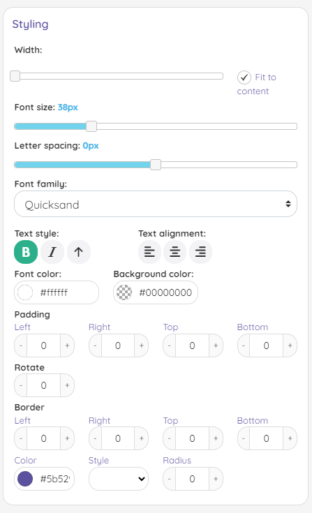
changes.Styling your elements
In the styling section, you will
have options to style your selected
element(s). The styling option can vary
from the type of element you have
selected.